I chose Pakistan and focused on the city of Karachi, where I grew up. Despite its diversity and cultural richness, Karachi lacks a cohesive and contemporary brand identity. The challenge was to create a visual and verbal system that unifies its many layers while celebrating its energy and resilience.
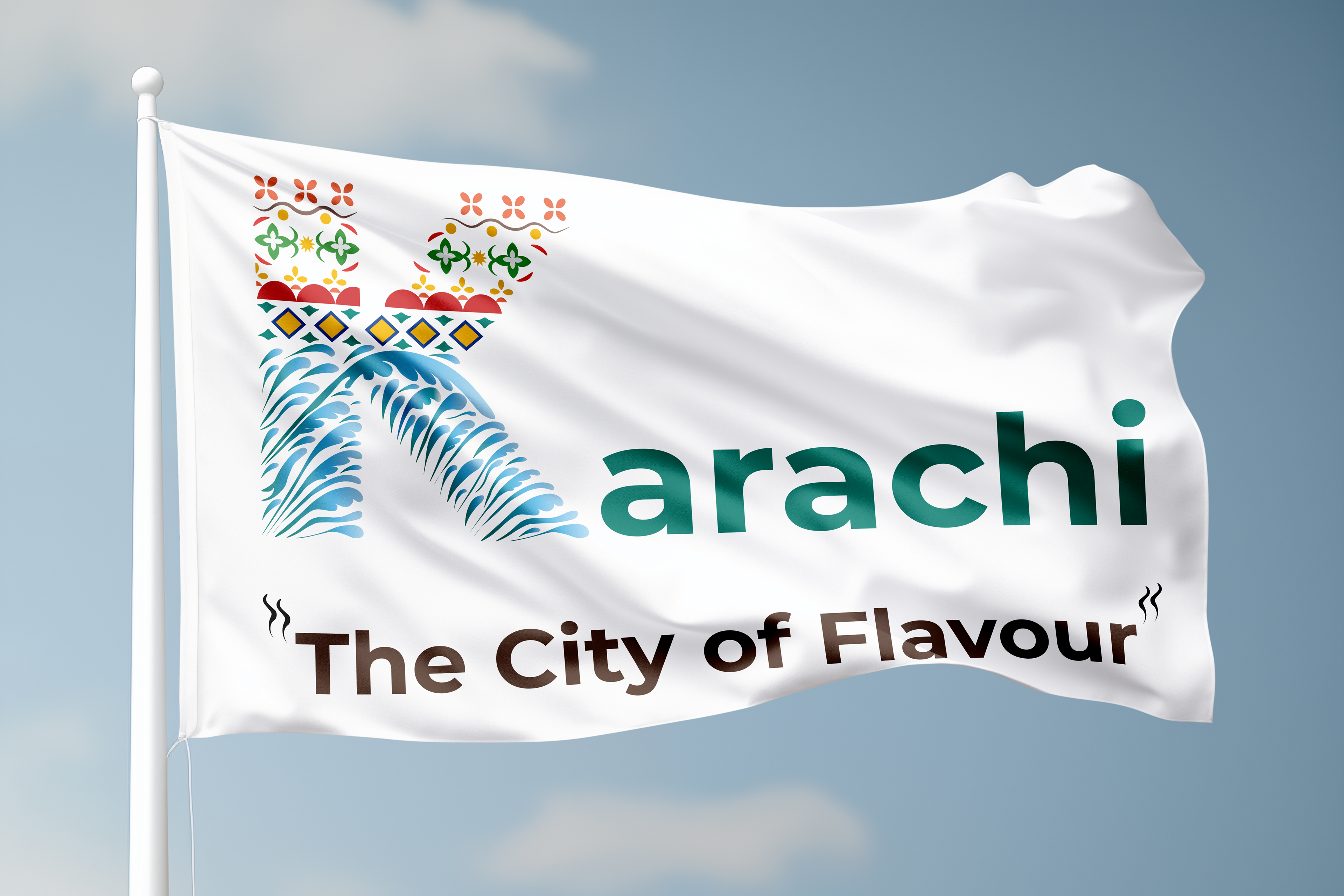
The City of Flavour” reflects Karachi’s rich cultural, culinary and social identity, making the brand feel warm,
vibrant and globally relevant.
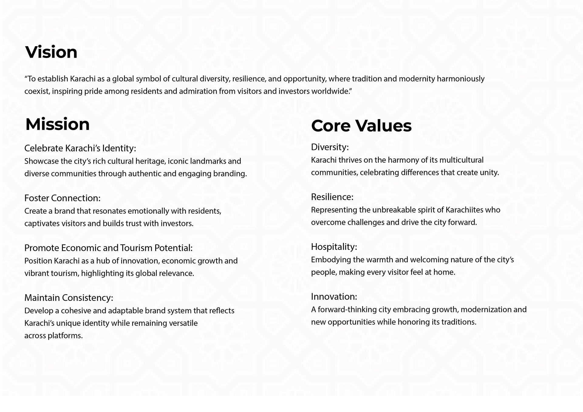
The vision and values guided the brand identity, ensuring it was authentic, resilient and future-facing.
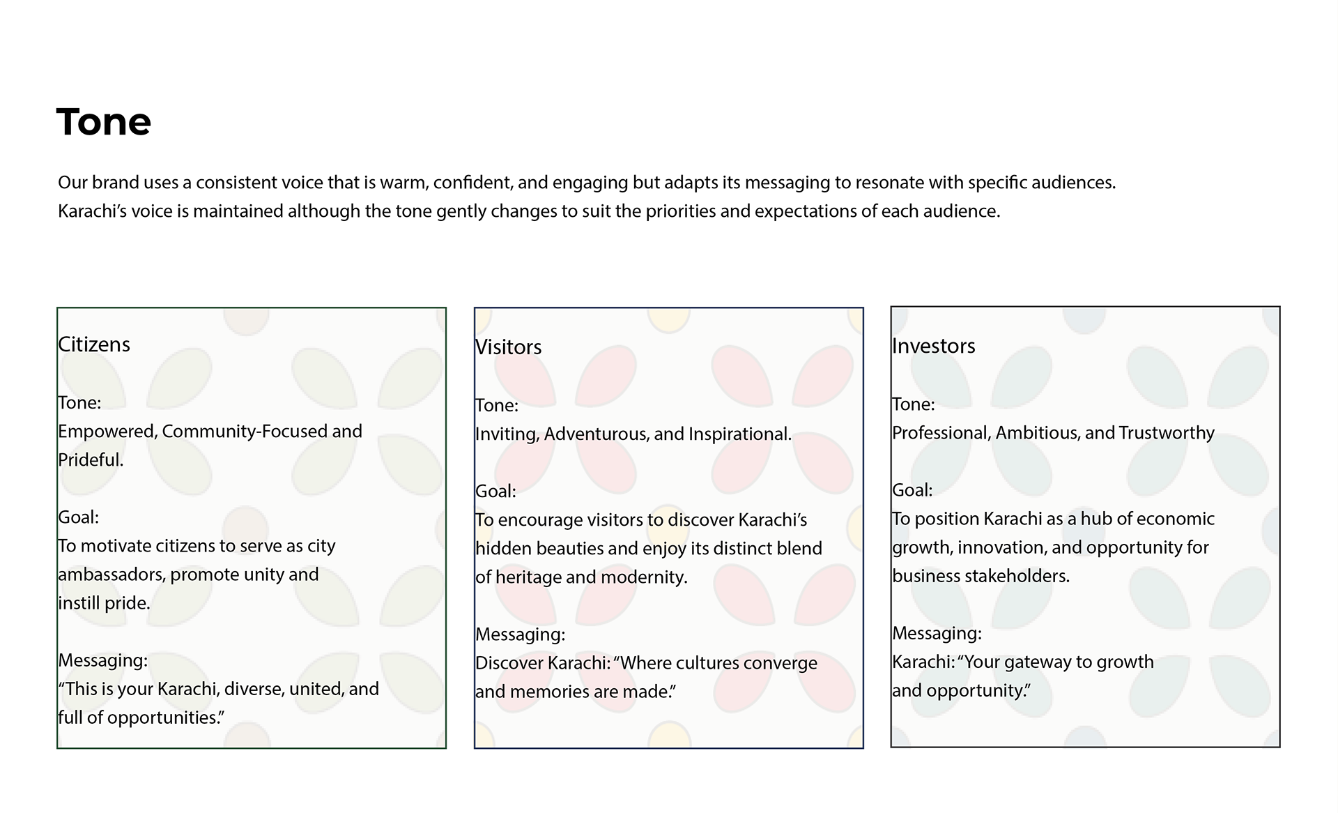
Tailored messaging for citizens, visitors and investors ensures the brand resonates with each audience while
maintaining a unified voice.
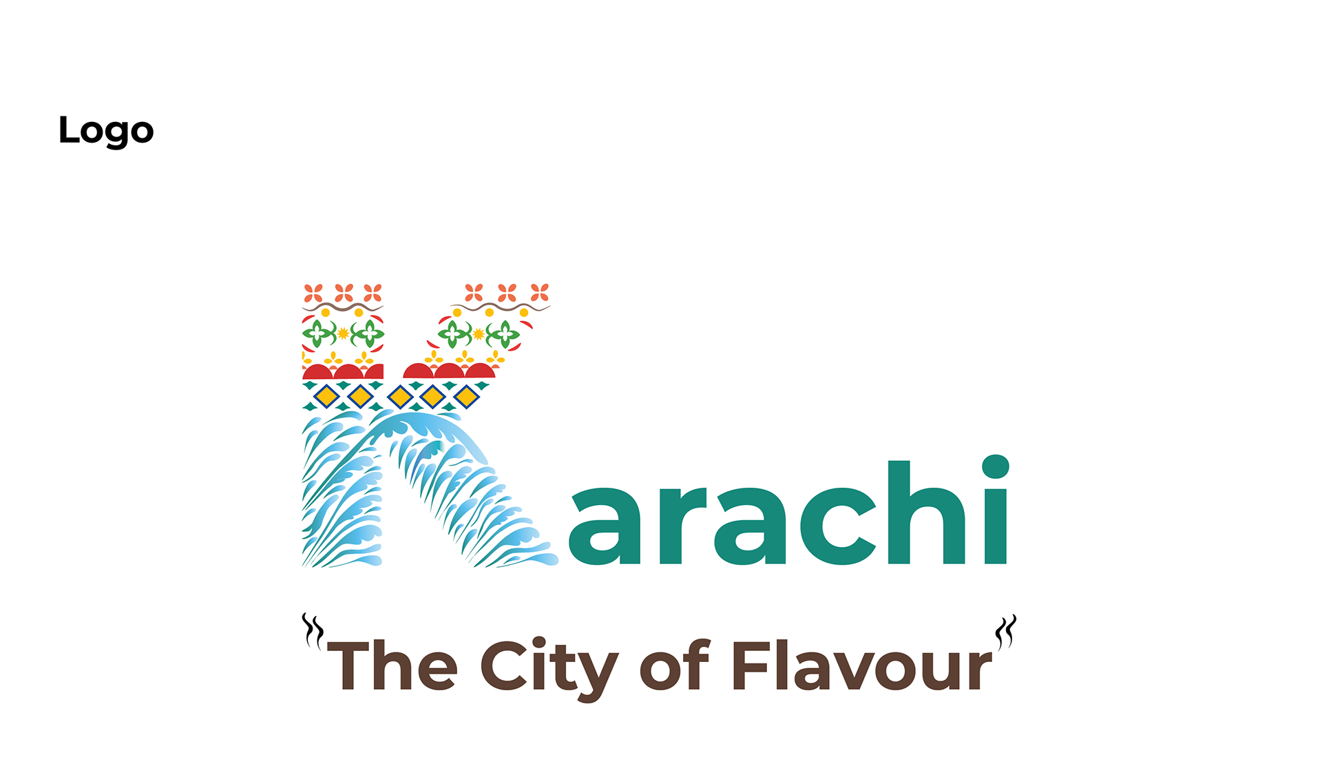
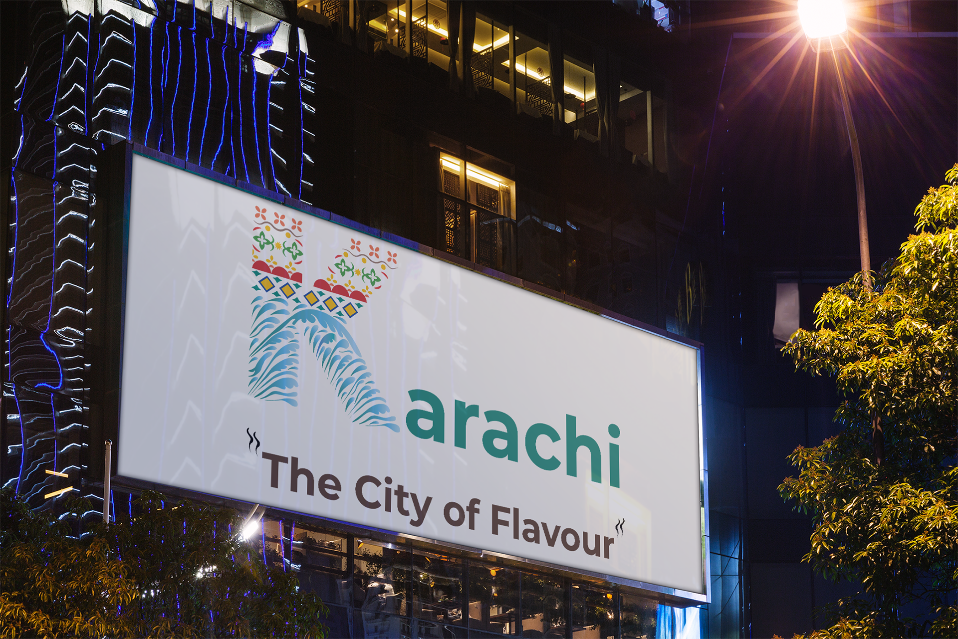
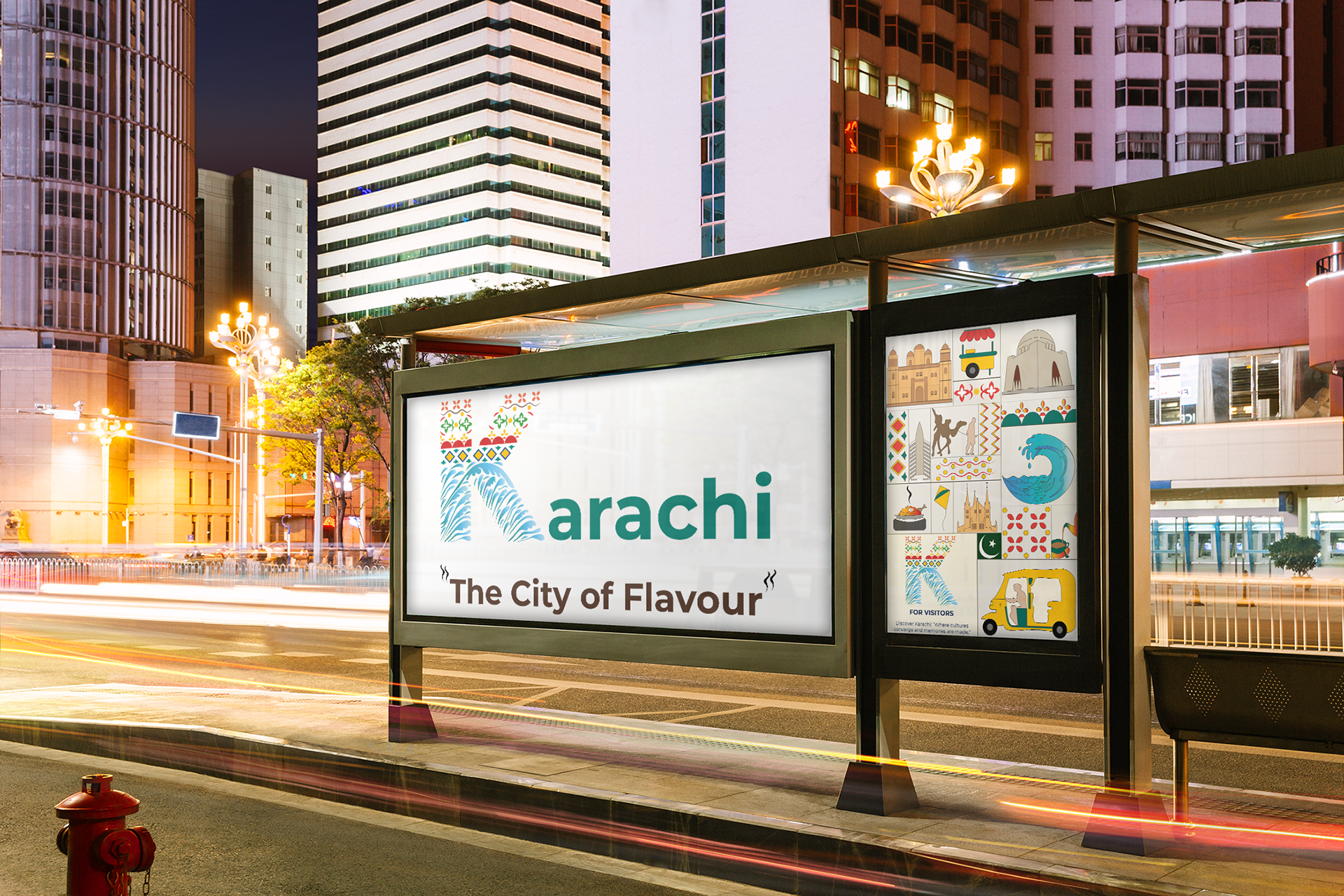
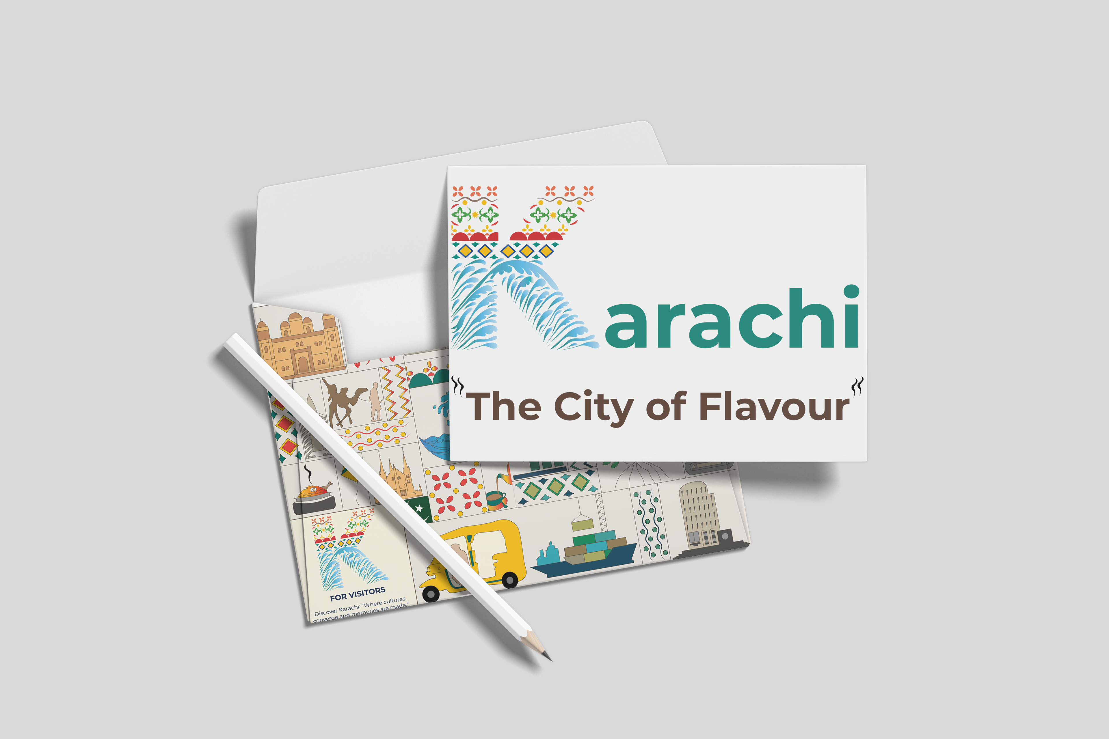
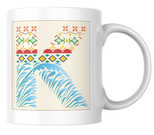
The primary logo combines cultural motifs and coastal waves with the strapline ‘The City of Flavour.’ The quotation marks mimic rising steam, symbolising Karachi’s vibrant culinary culture, warmth and hospitality.
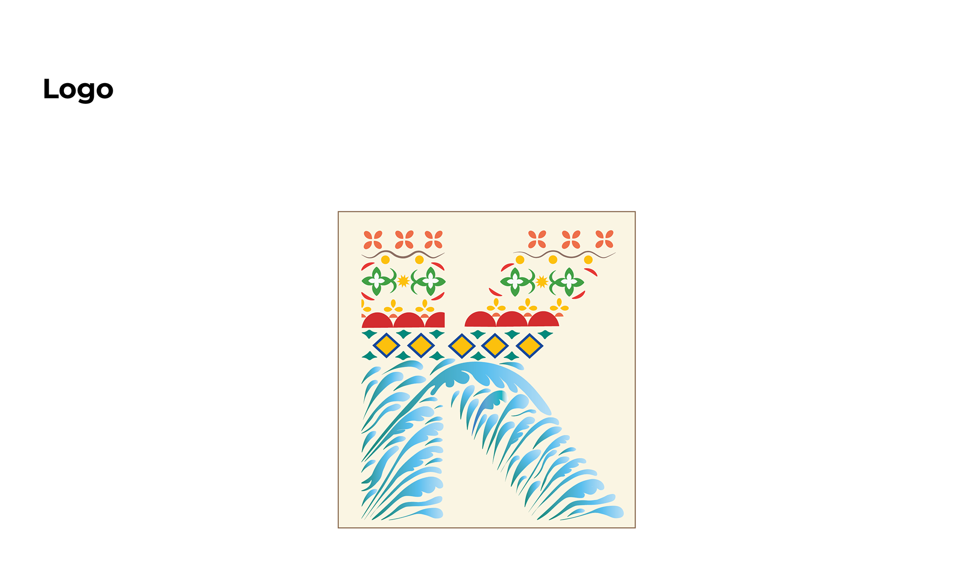
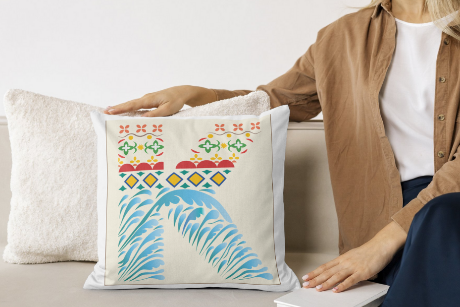
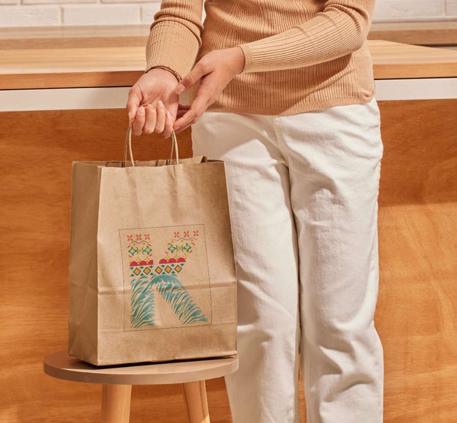
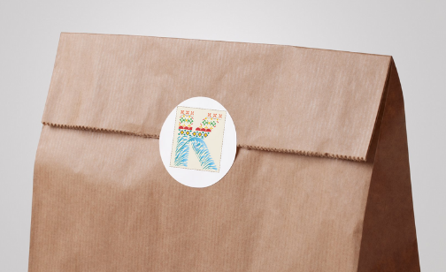
The secondary logo is a simplified ‘K,’ designed for compact applications such as social media, merchandise and icons. It retains the cultural patterns and wave motif, ensuring brand recognition even at small scales.
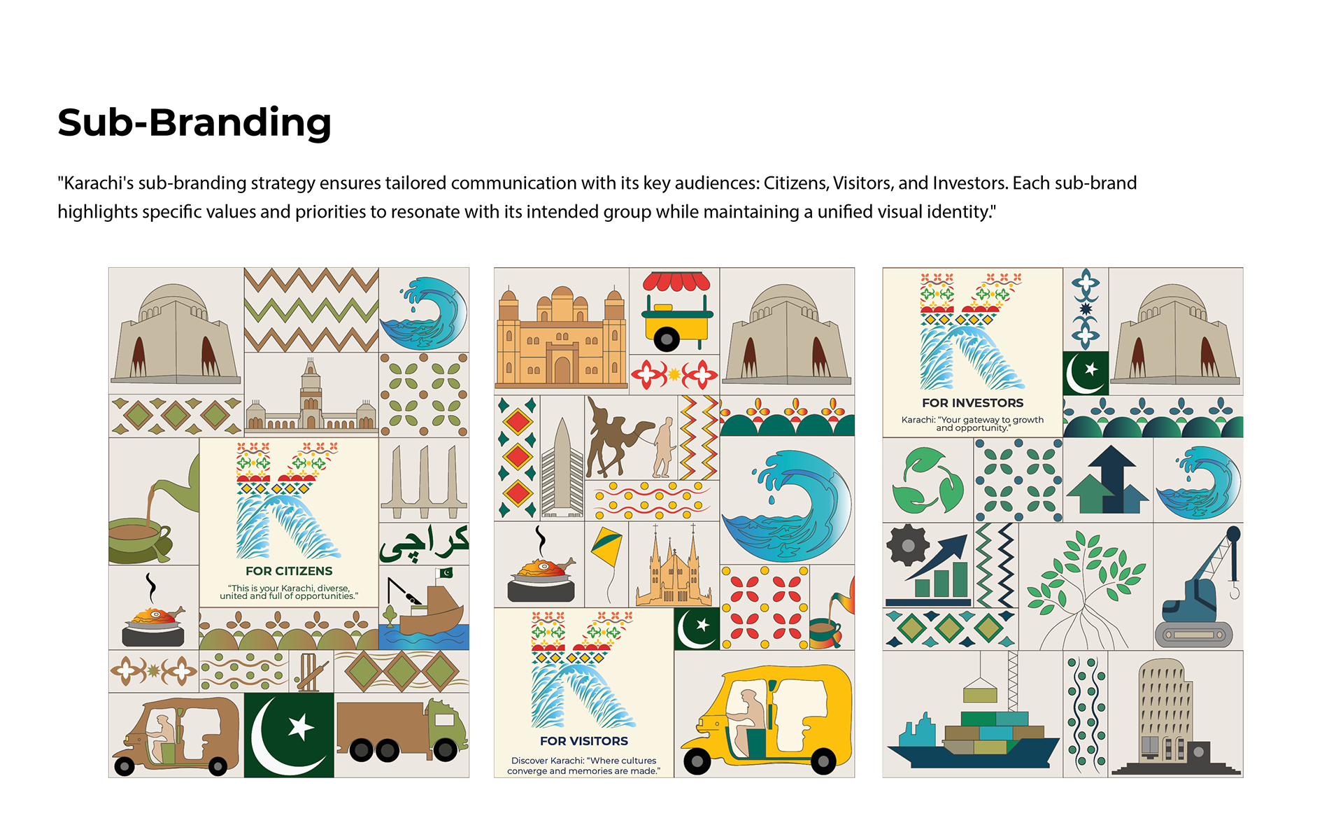
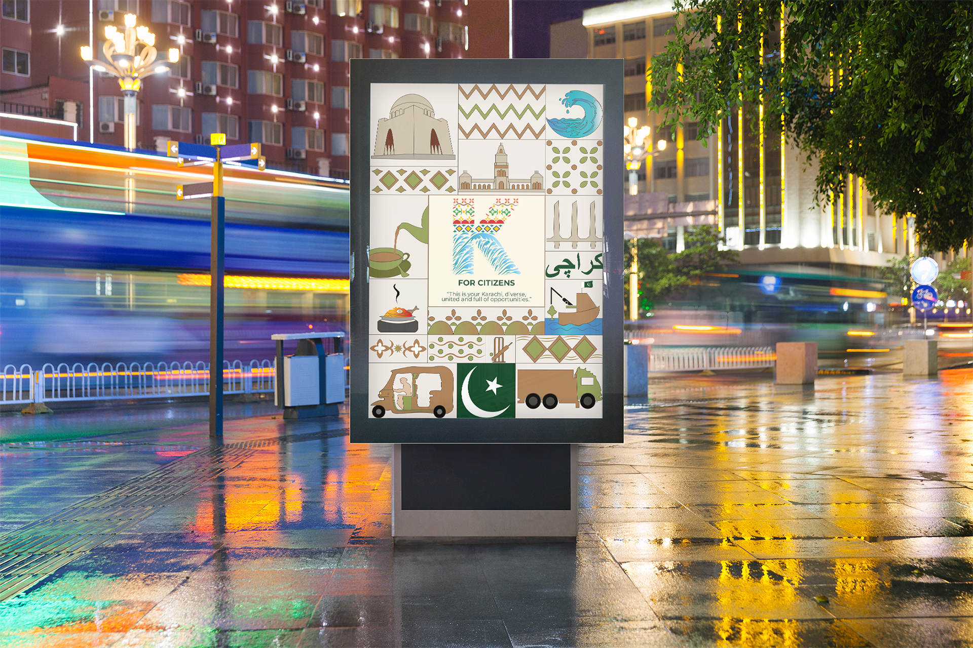
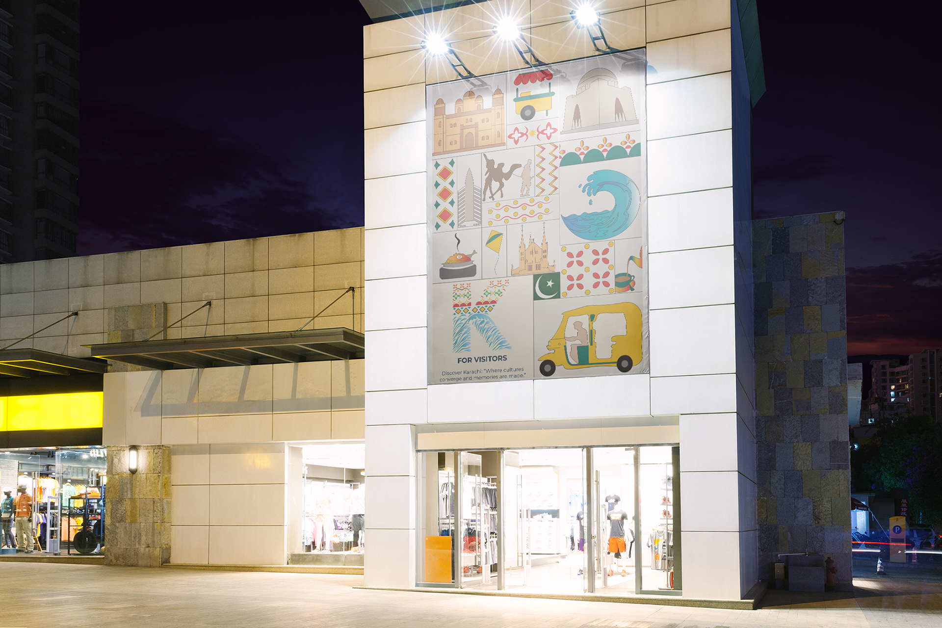
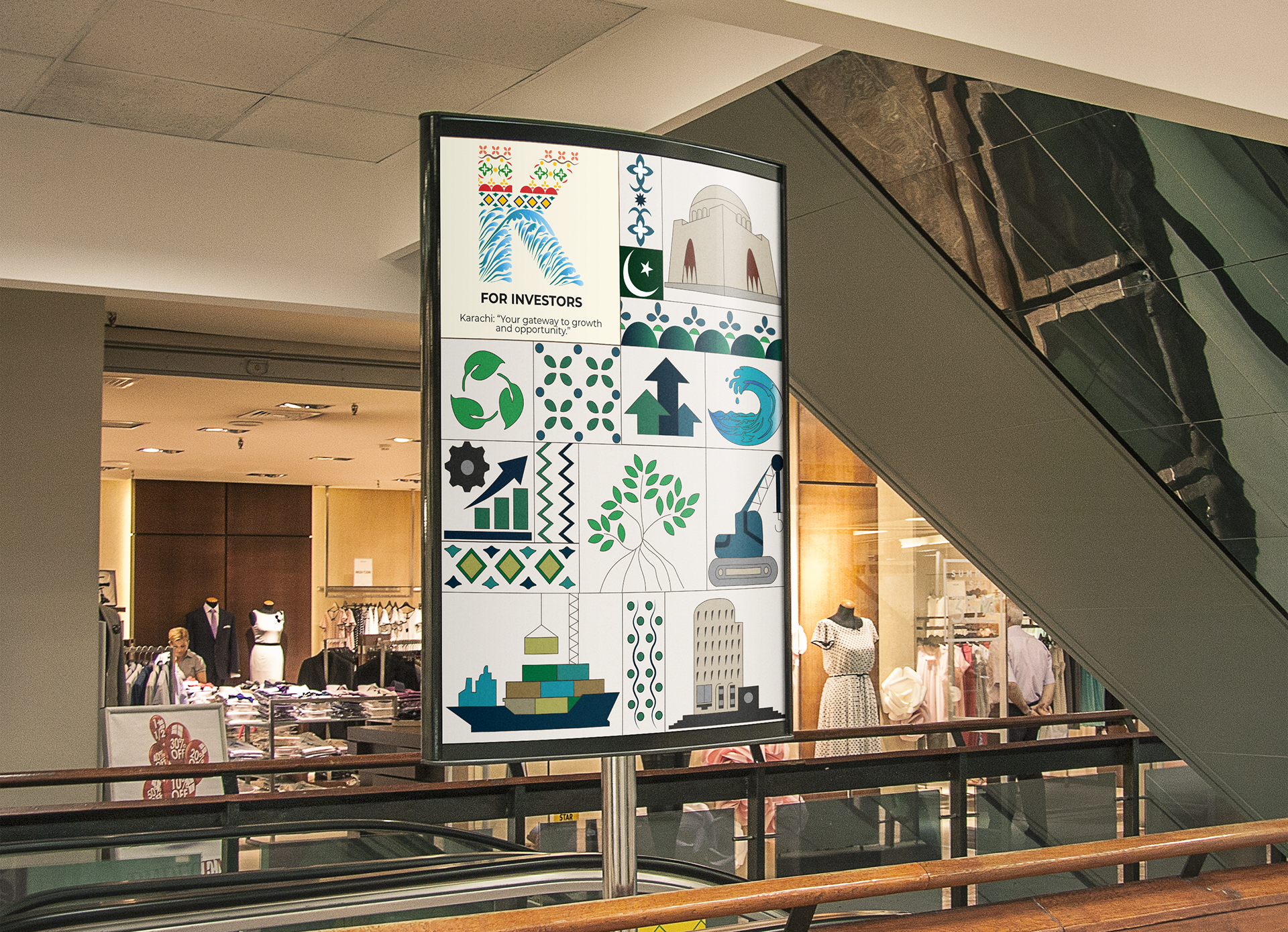
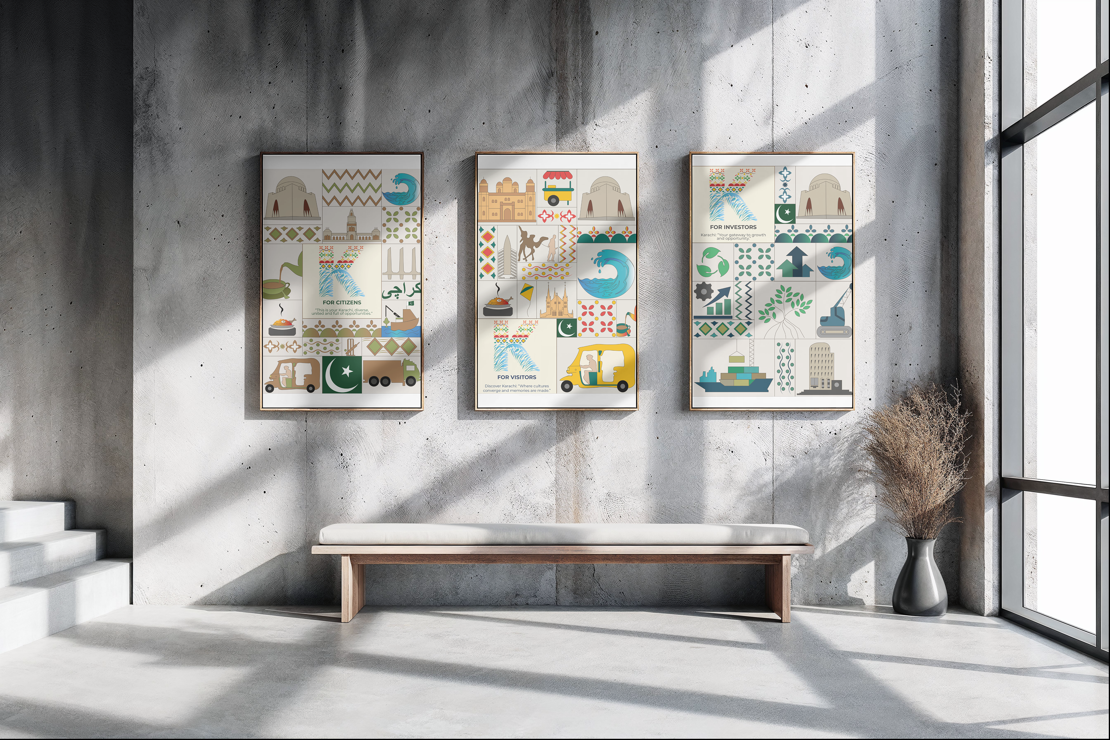
Tailored sub-brands were developed for Citizens, Visitors and Investors, each using bespoke icons and messaging while maintaining a unified identity.
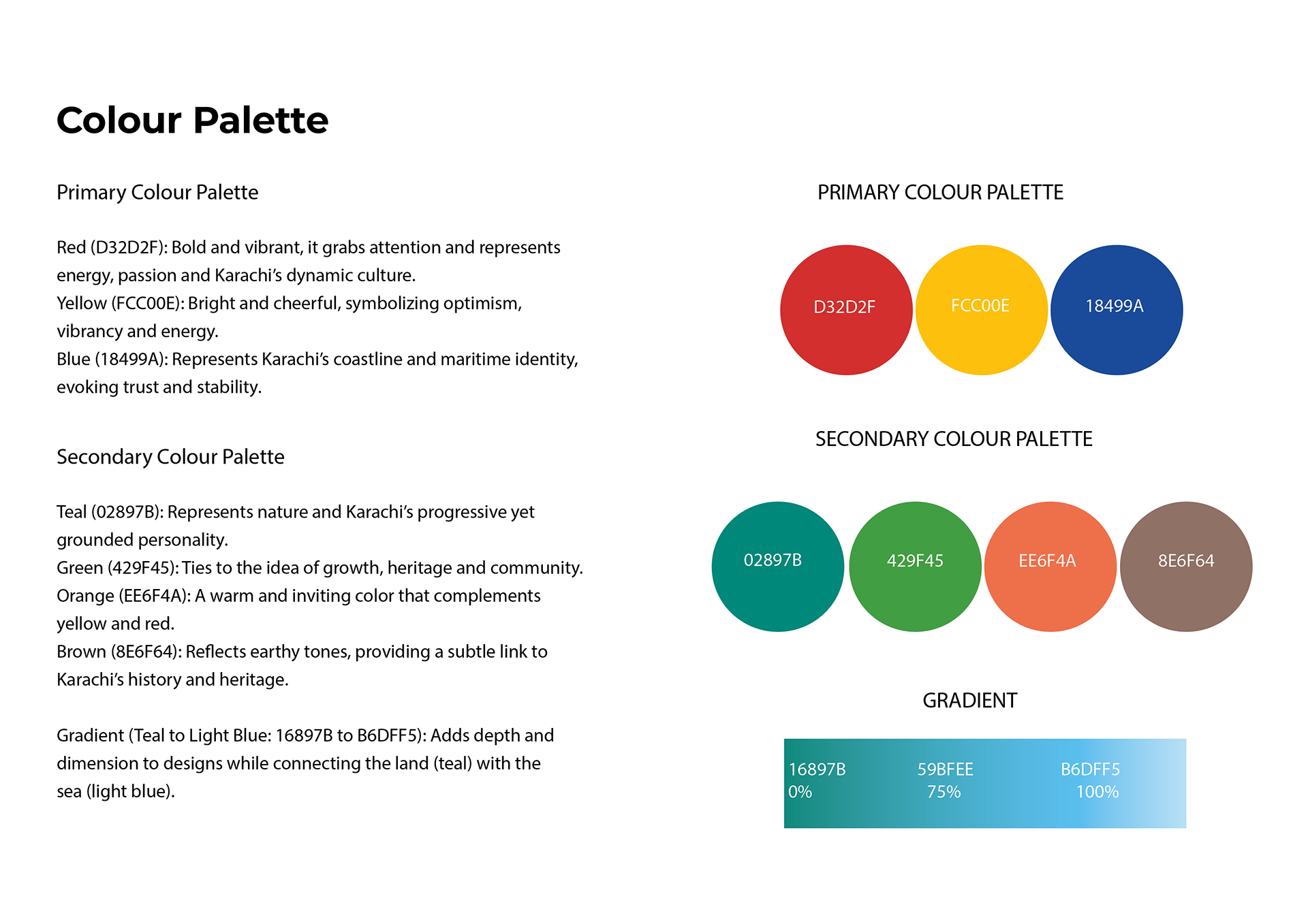
The palette reflects Karachi’s diversity, bold primaries inspired by food and culture, supporting tones drawn from heritage, nature and the sea.
Real-world mockups showcasing how the Karachi brand identity translates across urban environments and public spaces.