while suggesting interior improvements that enhanced atmosphere and brand consistency.
and street visibility.
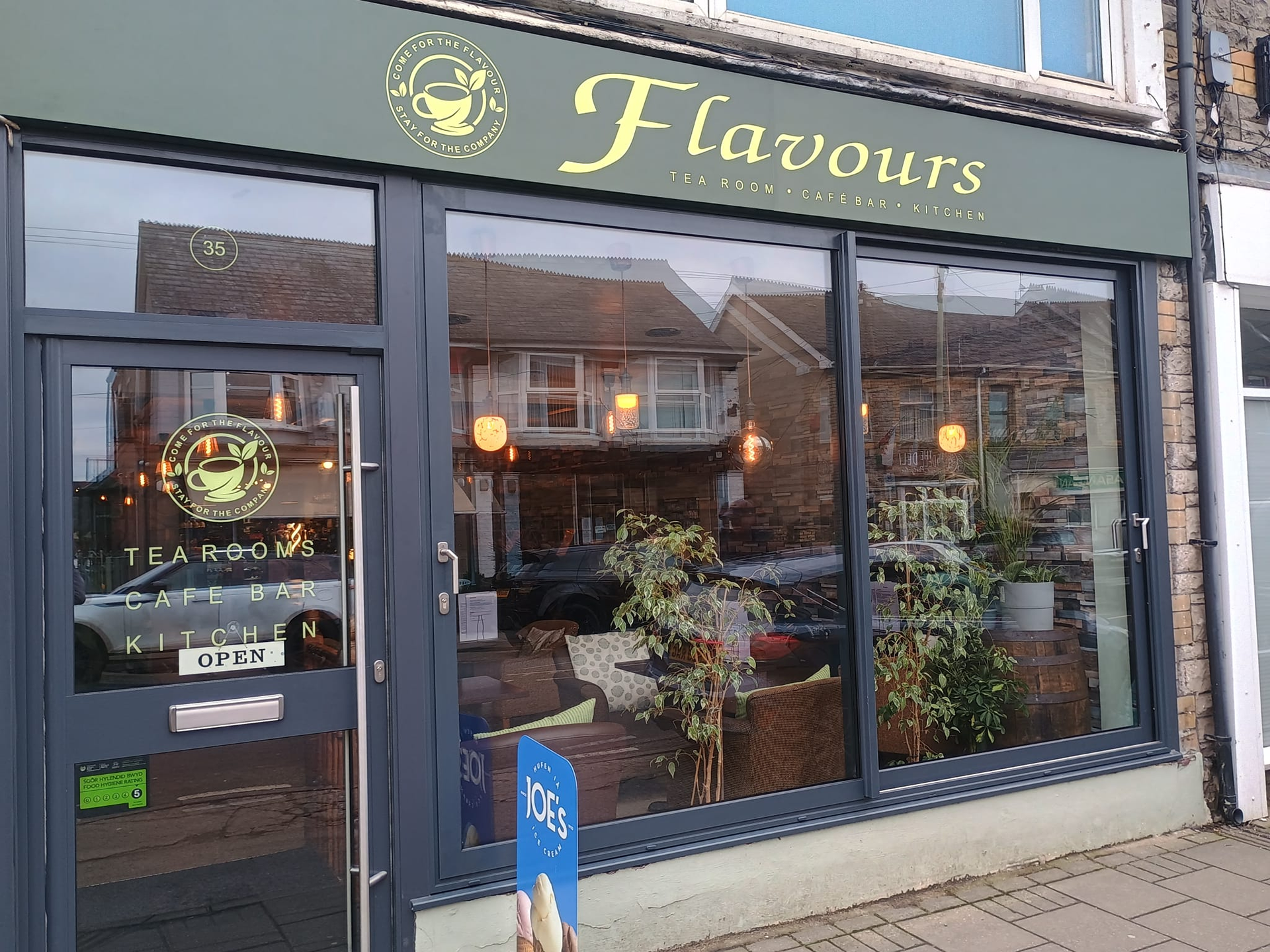
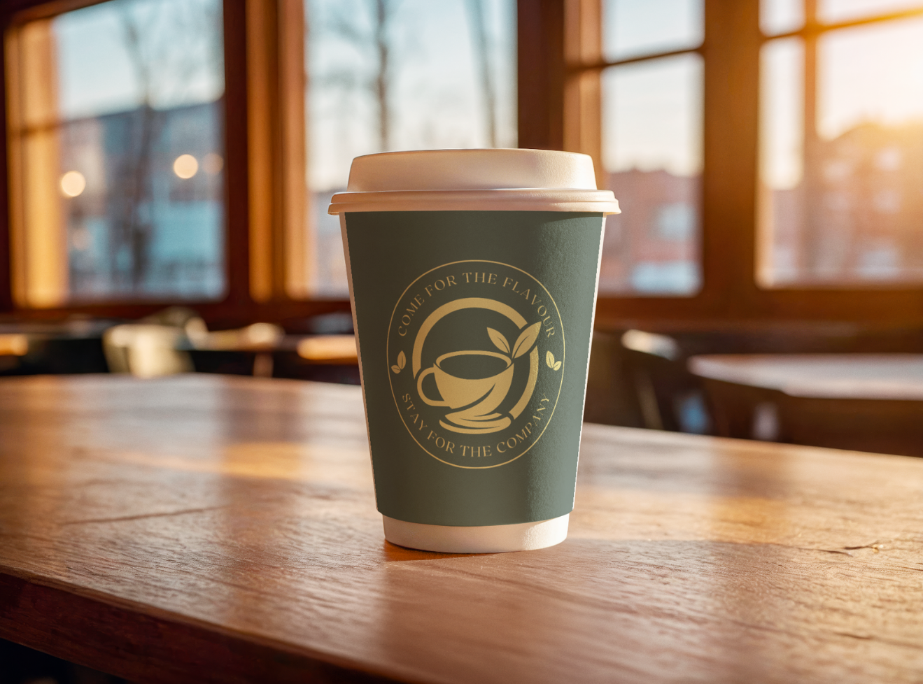
The new exterior signage introduces a modern brand identity with a refreshed logo, contemporary colour palette and clear typography, instantly elevating the cafe’s street presence.
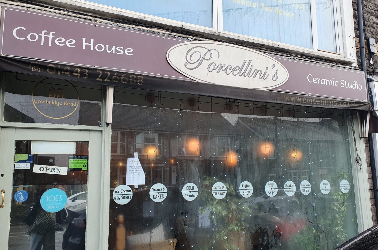
Before: Original exterior lacking visual identity and modern branding.
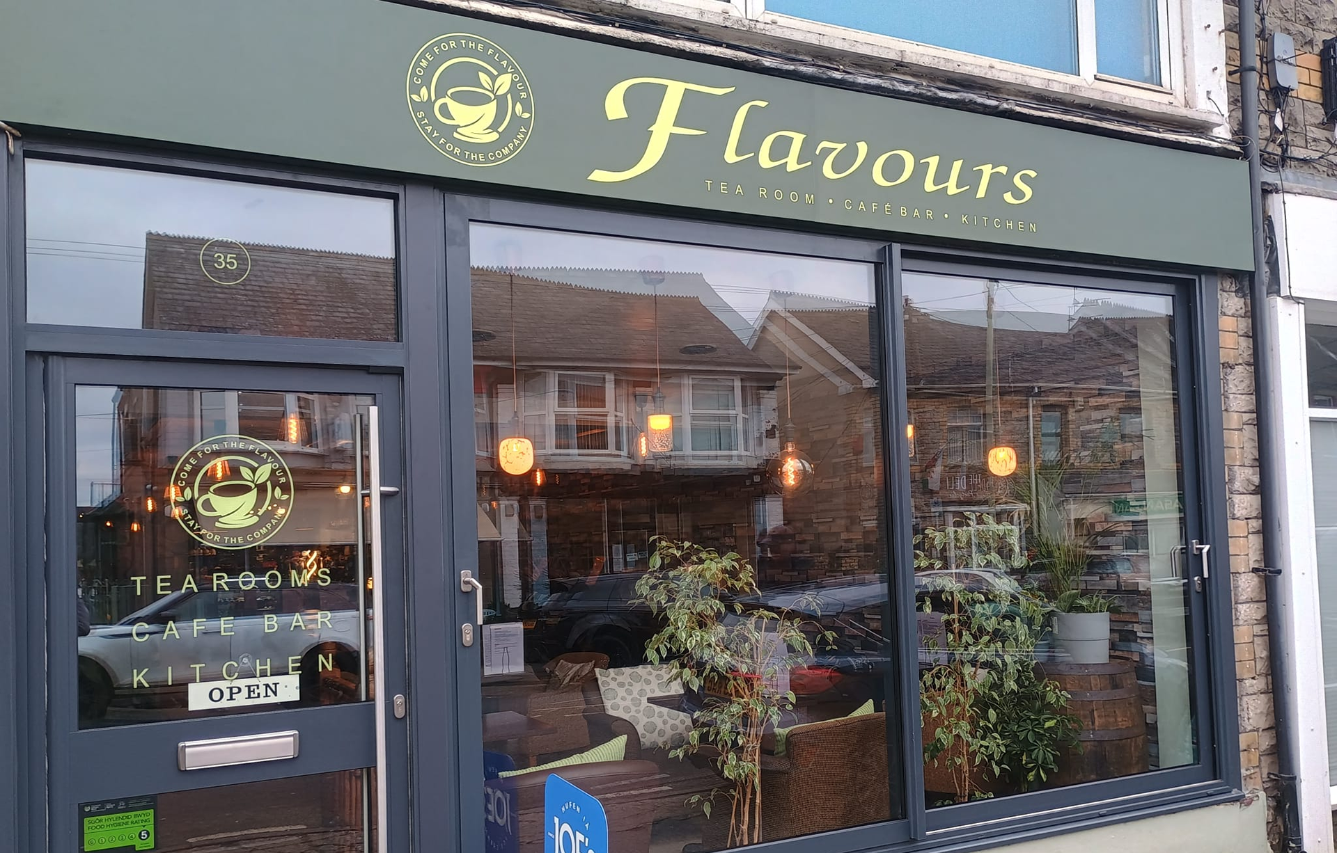
After: Refreshed exterior with new logo, colour palette and branded signage that enhances visibility and street appeal.
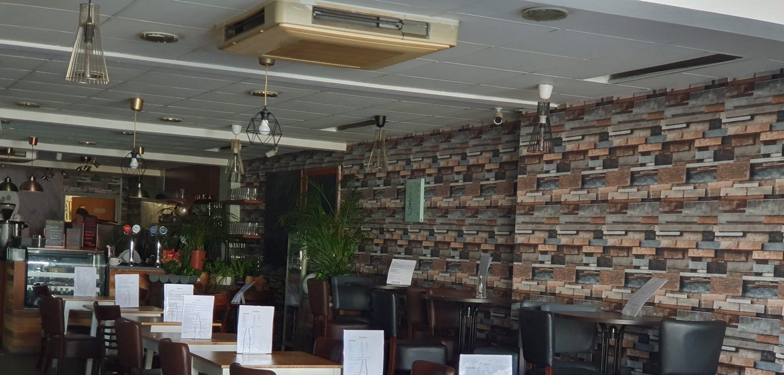
Before: The original interior felt dated and visually busy, with dark tones and heavy patterned walls that made the space appear cluttered.
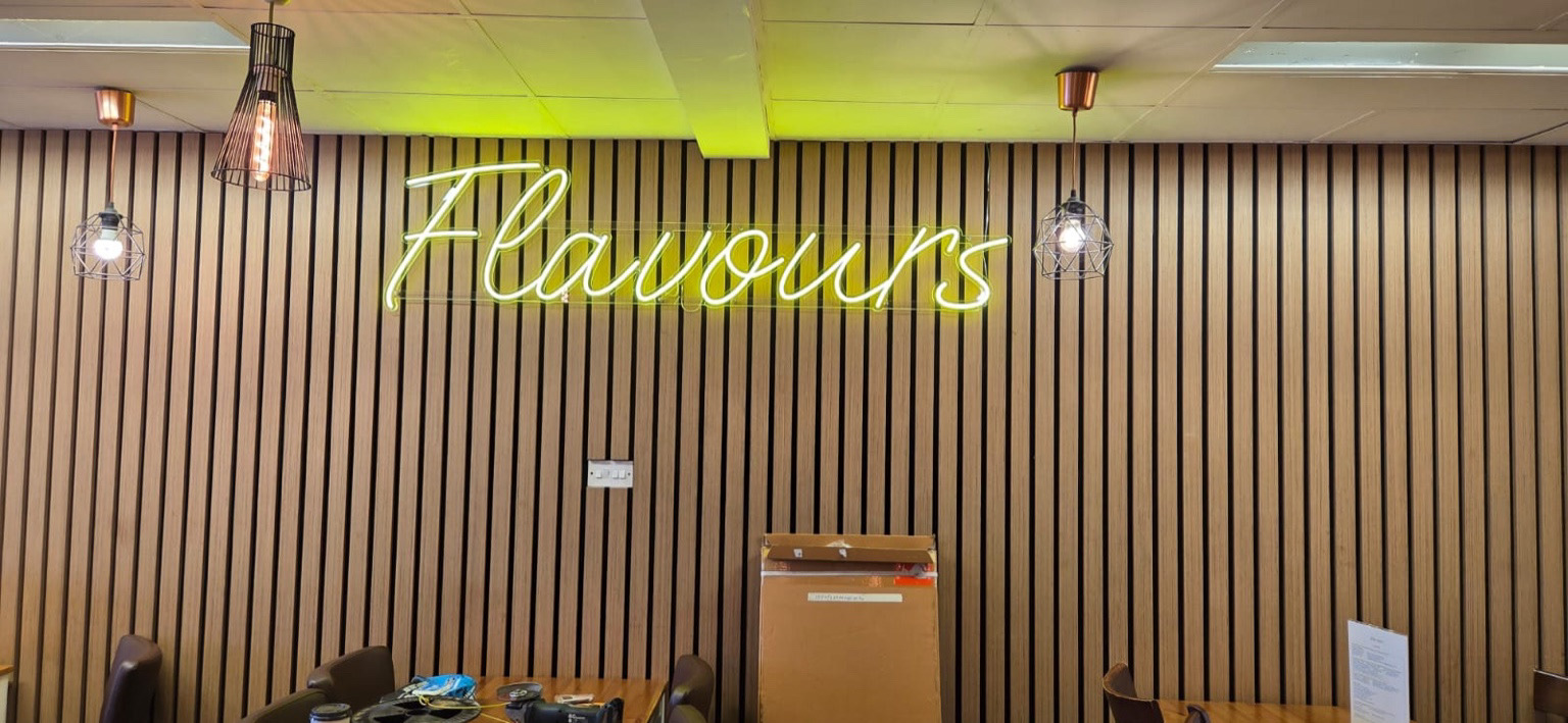
After: The redesigned interior introduces warm timber slats and a bespoke neon sign, creating a modern, inviting atmosphere that reflects the café’s refreshed identity.
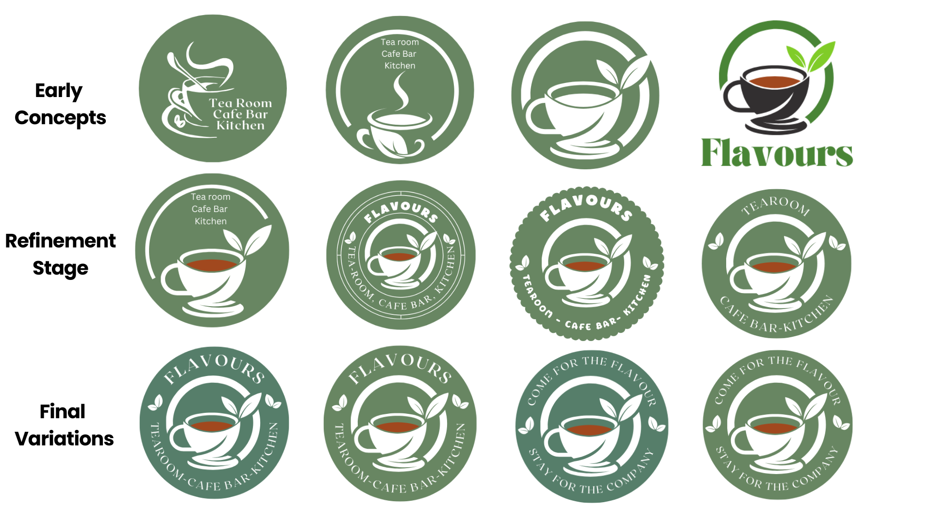
Logo Development: Exploring different shapes, compositions and typography styles to create a warm, inviting identity for Flavours. The design evolved from simple tea cup icons to a refined emblem that reflects freshness, comfort andzmodern cafe culture.
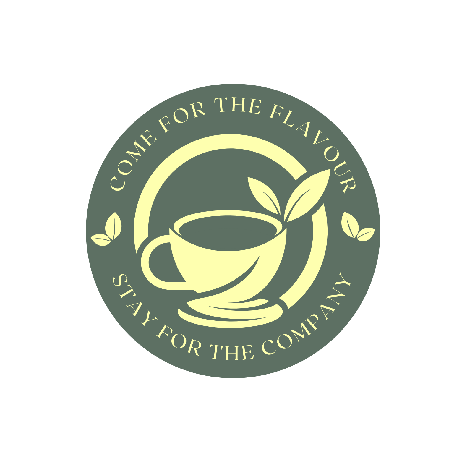
Primary Emblem Logo: A refined circular mark designed to communicate warmth, comfort and freshness, combining a tea cup with natural leaf elements.
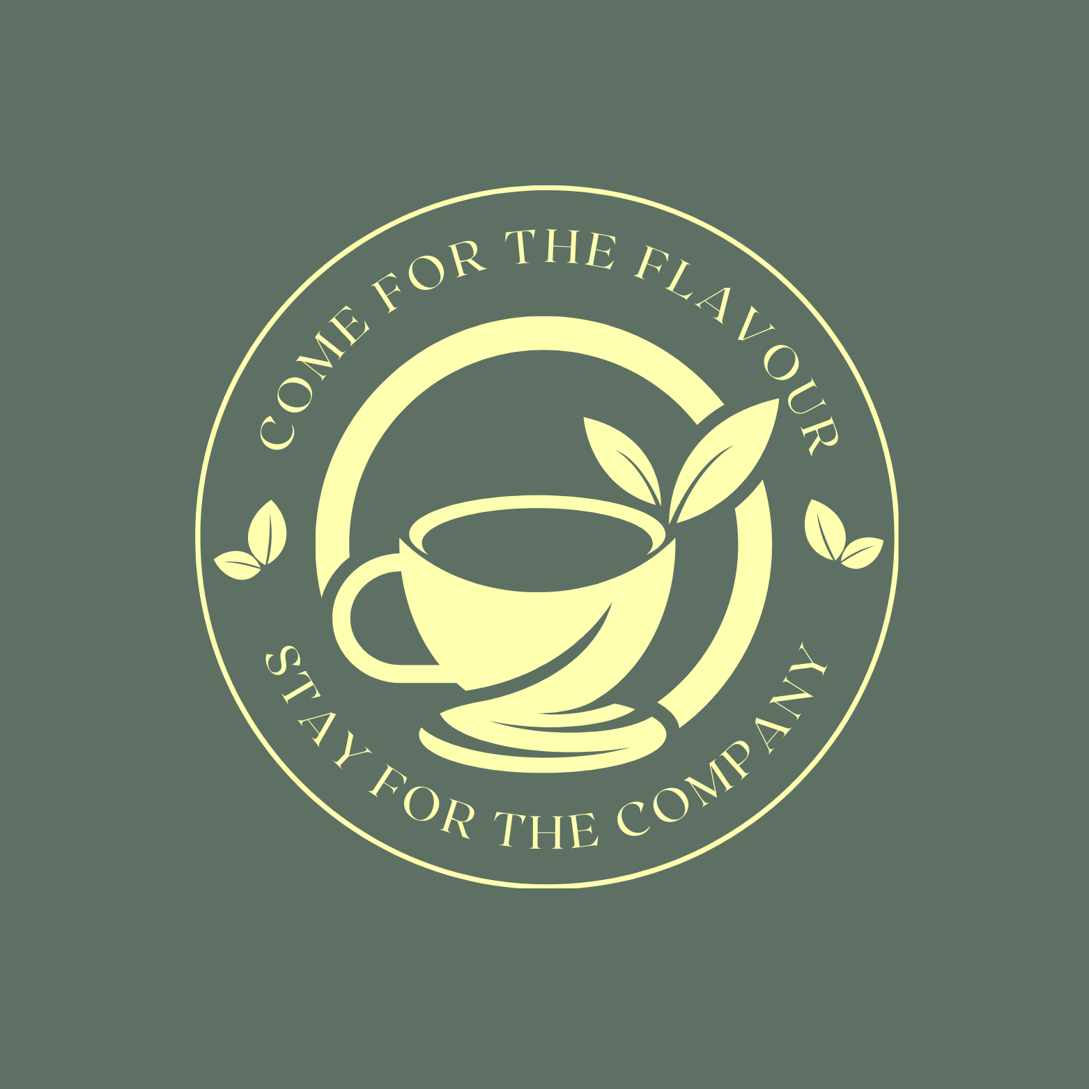
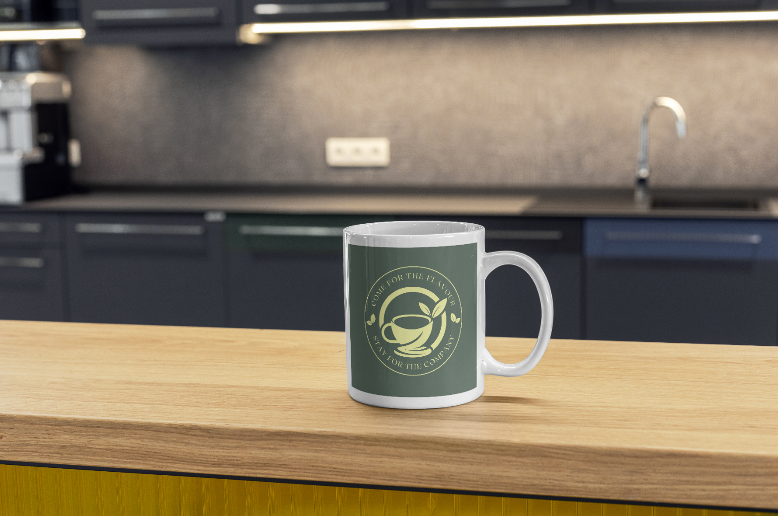
The emblem applied on the official brand colour to demonstrate contrast, legibility and how the mark appears in real-world use. Featuring the final approved green and lemon-yellow palette used on signage.
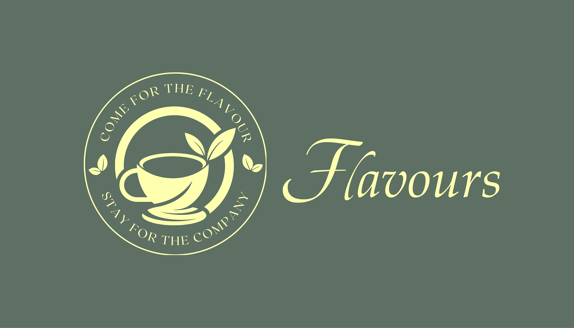
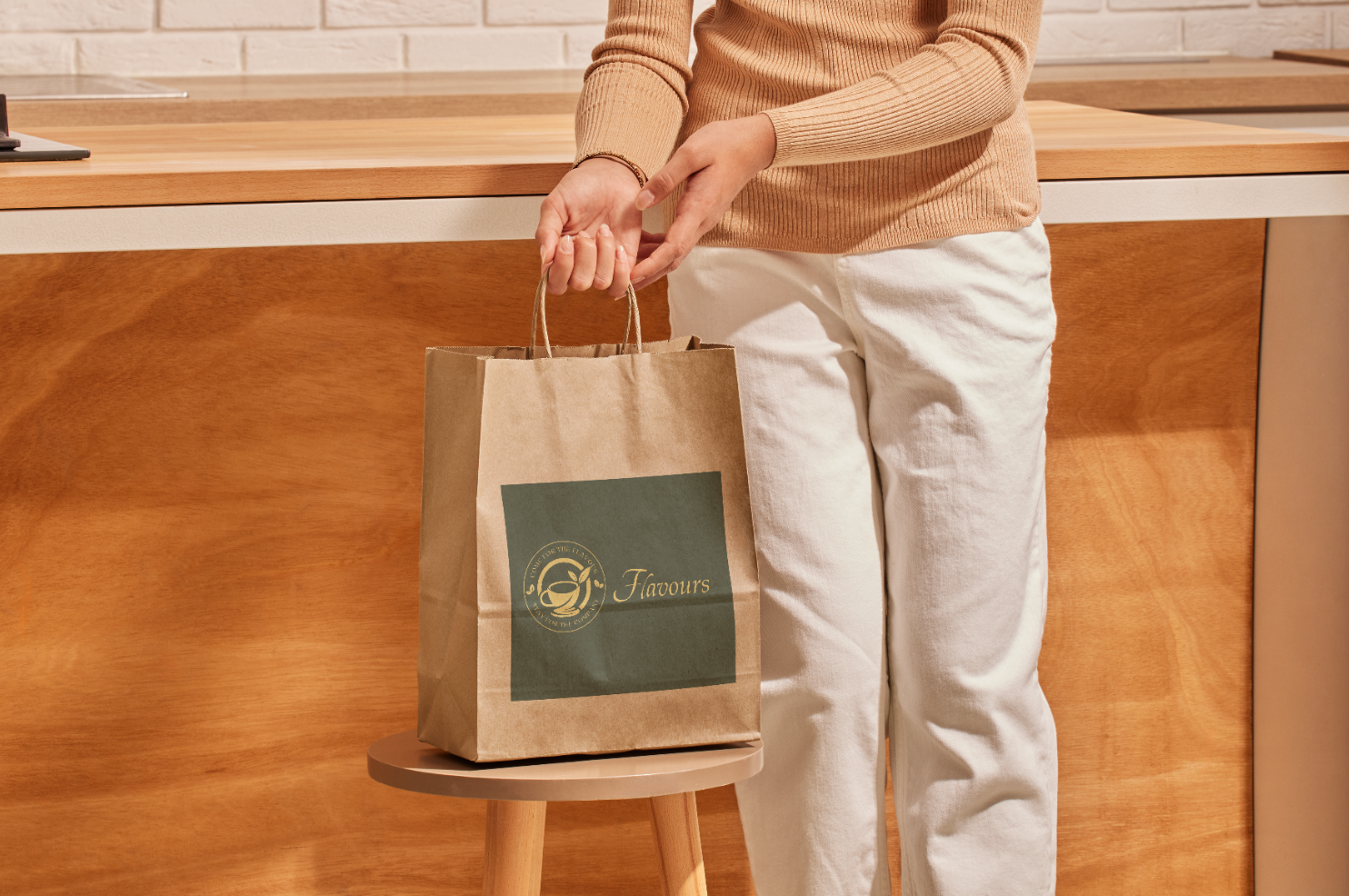
Full Logo Lockup: The primary emblem paired with the Flavours wordmark, matching the style and tone of the cafe’s storefront branding. Created to reflect the exact colours used on the actual shop fascia.
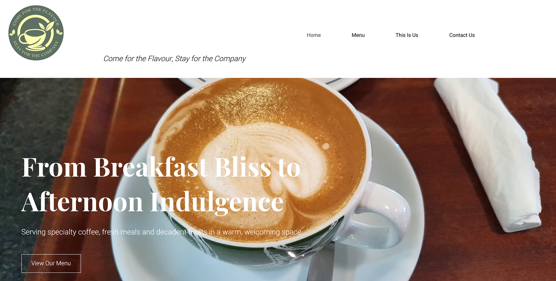
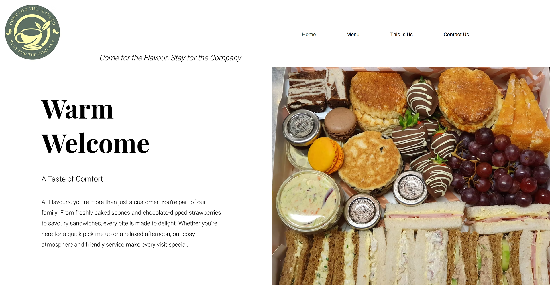
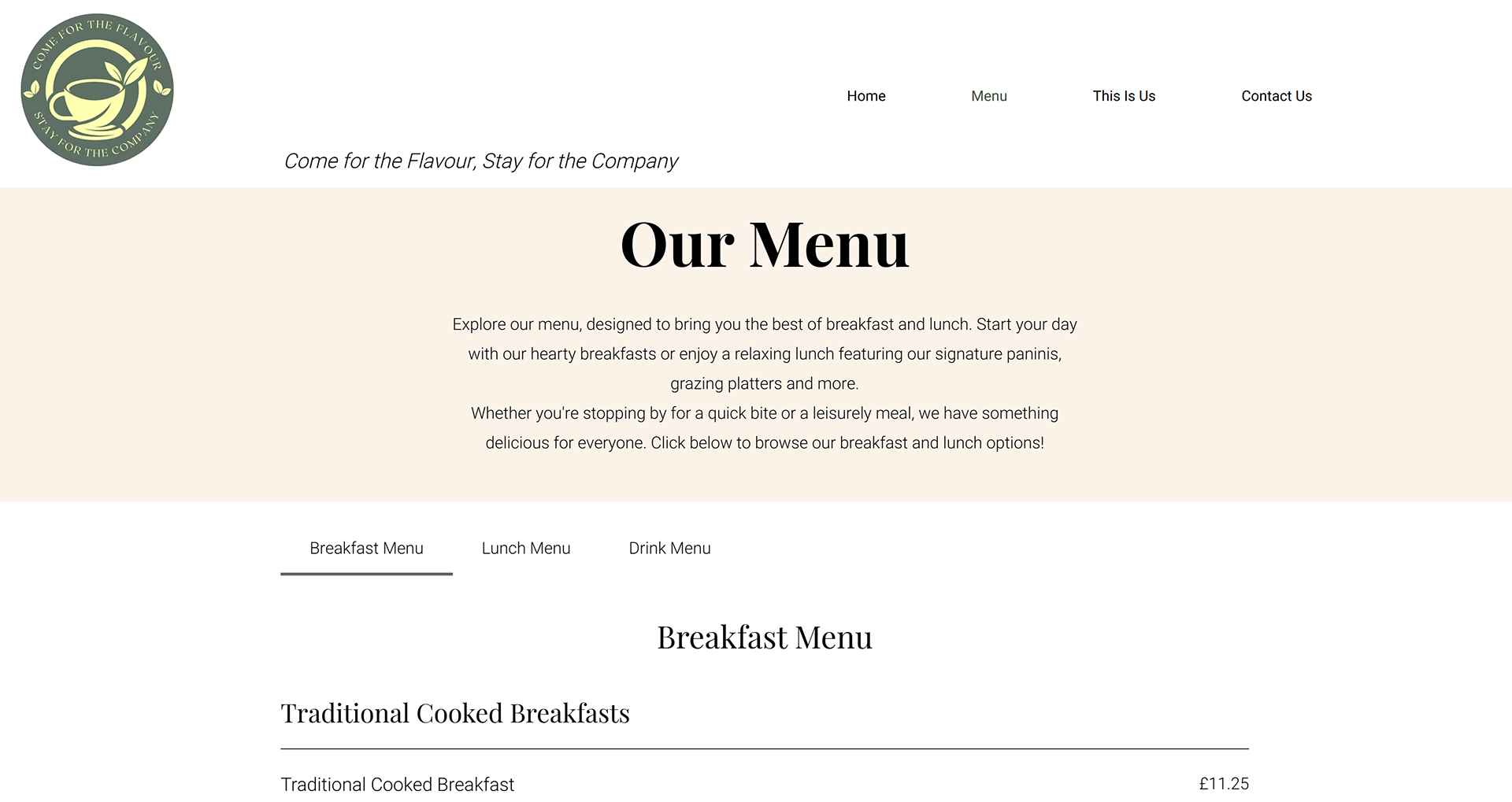
A modern, welcoming website that translates the cafe’s refreshed visual identity into a seamless digital experience, warm imagery, clear storytelling sections, and simple navigation for customers.